2019 sure is looking bright—at least when it comes to colors. If you count yourself among the fans of Pantone’s just-revealed Color of the Year, Living Coral , there are myriad ways to bring it into your home. The most straightforward of which would be paint, so we rounded up some matches from 7 paint brands so you can grab a gallon and (literally) get rolling on that new wall.
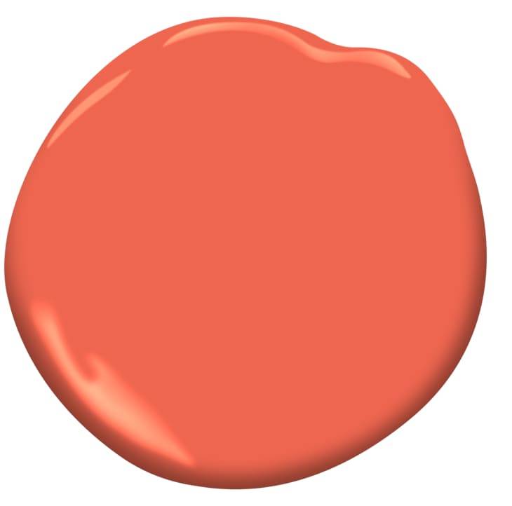
Benjamin Moore— Tangerine Dream 2012-30
“Given the vibrancy of Living Coral, an understated backdrop of our Color of the Year for 2019, Metropolitan AF-690 , would balance it out beautifully, as would some of the softer tones in the Color Trends 2019 palette, such as Balboa Mist OC-27, Smoke 2122-40 and Soft Fern 2144-40.”—Nivara Xaykao, Benjamin Moore Color and Design expert
Sherwin-Williams— Coral Reef SW 6606
“Coral is a great accent color and is often used to bring pops of color into more neutral spaces. If you want to go bold, but not overcommit, try using Coral Reef SW 6606 to paint the kitchen island, as an accent wall or within artwork in the room.” — Sue Wadden, Director of Color Marketing at Sherwin-Williams
Glidden— Celebration Orange
“Pantone’s 2019 Color of the Year is a fun hue that creates maximum impact in a small space. GLIDDEN® paint’s Celebration Orange (25YR 34/473) is very similar to Living Coral – a happy, unapologetic pinkish orange that will wake up any room. We recommend incorporating this color through décor or as an accent wall.”—Misty Yeomans, senior color marketing manager for the Glidden paint brand
Valspar— Orange Slice
“Living Coral sparks conversation about the coming year, and Valspar’s 2019 Colors of the Year similarly highlighted how the digitally-connected world encourages experiments at home. Valspar Orange Slice 2002-1B has an active orange with joyful yellow undertone, which gives us an unexpected surprise and encourages us to dream about the next project. This expressive and playful coral makes an ordinary home office into a bold expression and creates a space to stimulate your creative mind.”—Sue Kim, Senior Color Designer of Valspar
PPG— Siesta Rose
“Pantone’s Living Coral is what we would consider a high-alert hue that creates a big statement on any surface. Although welcoming and cheery, we don’t recommend using a color this vibrant on all four walls, since bright colors tend to expand once on the surface and can overpower the room. PPG paint brand’s Siesta Rose (PPG1188-5) is a close match that would look great as an accent wall, especially when paired with softer neutrals like PPG paint brand’s Whiskers (PPG1025‑3) or Flagstone (PPG1001‑4).”—Dee Schlotter, PPG senior color marketing manager
HGTV Home by Sherwin-Williams— Dishy Coral
“Living Coral speaks to one of the colors found within HGTV HOME by Sherwin-Williams’ Mystic Light Color Collection of the Year. Dishy Coral (HGSW1065) is also energizing, but soft, and was inspired by the multi-sensory experiences that we are seek in order to achieve internal balance. Use Dishy Coral as an accent with accessories and decor, or as an overall wall color that is bold, lively, and perfect for social spaces.”—Ashley Banbury, Senior Designer of HGTV HOME by Sherwin-Williams
Farrow & Ball— Charlotte’s Locks 268
“A deep and playful orange, Charlotte’s Locks takes its inspiration from the flame red hair of our Head of Creative and brings a playful late 1970s look. This deep and dramatic orange is particularly spectacular when used in small areas with a sharp contrast either in All White or Black Blue—for the very brave, do try in Full Gloss!”—Charlotte Cosby, Head of Creative at Farrow & Ball