I bought my house because I loved the colors of the walls. The living room was sunflower yellow, the dining room a bright acid green, the kitchen was spicy orange red. I bought my house the first day I walked through it . But the reason the rooms felt so “right” comes down to more than feeling—it’s how my mind thinks about color.
I have grapheme-color synesthesia, which means that my brain “sees” letters and numbers as having specific colors. When I focus on a word or name, my mind visualizes a color palette that’s aligned to the letters —names with “i” and “e” are white and yellow, names with an “o” or an “m” are black or dark blue. (You can see the color of your name based on my colors her e .) This visualization also works in reverse, too, and some color palettes make me think of specific words or names.
How I Experience Color In Names
Names and words come together in my head as immediate color palettes. It’s not based on how the name sounds—it’s how the name is spelled and the colors of those letters. The best way I can describe it is like a curtain of different colors sliding into the back of my head.
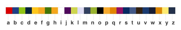
Here are the colors I see in my head for each letter of the alphabet. (It’s important to note that others with grapheme-color synesthesia experience different colors connected to each letter.) Some words are light, some dark, and some more powerful than others. Vowels can really define a word, and words with an A often have a strong “spark” of red. Words with a lot of “i” or “l” letters make me think of white airy space. The letters “e” and “y” are always sunshine, and the letters “c,” “k,” and “n” are all electric shades of green.
All of this color activity in my head leads me to have certain feelings about names and words based on how I feel about those letters. If I meet you at a party and you have an “a” in your name, I’m going to ask you a lot of questions to try to discover what that hidden “a” spark may be.
Maybe it’s not a coincidence that many of my closest friends have names that are darker, with pops of red. I see my friends Maura, Matt, and Alison as interesting, confident people.
On the other hand, I also have a number of friends with very bright names—Eileen, Nikki, Emily, Colleen—who I consider to be optimistic, energetic people. Their names light up my mind and put me in a good mood.
Finally, names that have lots of dark consonants and non-vibrant vowels put me at ease—Bill, Tom, Bob, Milo, and Otis.
How I “See” Colors In My Own Home
The connection between letters and colors can be so strong that the visualization can work in reverse, too. Whether it’s the walls or the accessories, the colors in my room can give me a synesthetic color reaction, just like letters in a name.
For example, I had a red dining room for years because I felt like it inspired conversation. Red rooms trigger the same “spark” feeling I get for names that have an “a.” Rooms with pops of yellow will literally make me smile. I adore dark, navy blue rooms with white trim because they make me feel safe and put me at ease. My staircase and hallways were navy blue for a long time. It might have subconsciously calmed me down on the way to bed.
It doesn’t happen for every room—some rooms just aren’t colorful enough to make my mind feel that overwhelming correlation—but when it does, I can feel it.
So those bright saturated rooms in the house that I bought? My brain sees them as “relax,” “dining,” and “eat,” and those words matched what I wanted those rooms to be.
When you look around your home, do the colors make you feel a certain way? Maybe they energize you, or make you feel especially creative or comfortable? Show me a beautiful room and my mind will assign it a matching word, which could be anything from a feeling to a first name.
As time went on, living with so much color—both on the walls and in my head—became a little overwhelming at home. I toned down a lot of it, shifting to neutral greenish-grey walls and geometric, monochromatic patterns. For each room, I choose color accessories based on how I want to feel when I’m there.
The living room: All the accessories are white, black, or gold, and the pops come from blocks of color in the paintings and the specks of orange and magenta in the rugs. It’s the opposite of stimulating. In this room, I can focus on thinking, reading, relaxing, and shutting down for the day. The word that comes to my mind here is “solitude.” It’s a solid, weighty word with lots of blues and dark vowels, and peaks of subtle lightness from the “i,” “l,” and “e.”
The kitchen : There’s something about a red kitchen that always seems right to me. It took me a few years, but I finally updated my kitchen with gray walls. It did a lot to lighten up the room, and I’ve kept pops of red with accessories and vintage Pyrex pieces. This room makes me think of “Olivia” or “David,” because most of the room is neutral with dark tones, with a selective pieces of red.
The sunroom: I love the orange and red pops of color layered on the light gray chairs combined with the backdrop of all the green foliage. This room opens my mind and makes my brain happy. If I were to name this room, it would be “Rachel” or “Charles.” Those names contain the brightest and happiest letters, and are the closest my mind comes to visualizing a rainbow of letters.
My bedroom: I didn’t paint every room gray. The bright green walls and bold blue green rug in the bedroom set the tone for how I wake up every day. There’s no more optimistic color than a sunny yellow-green, and this room makes me feel energized. This room is both “light” and “night.”
So what’s next? I’m finally at a point where I feel like my house speaks to me in the ways I want it to, and I feel lucky to have my personal color palettes to guide me. I also believe that anyone can do this for themselves, even if they don’t have synesthesia.
Choose a room in your house and think of a word that you’d want to use to describe it. For example, maybe you want to up the energy level in your office. Take a minute, close your eyes, and think of something that makes you feel inspired . Maybe it’s your favorite flowers, or a piece of art, or the cover of the book you’re reading. It could even be your running shoes or the dog’s leash.
Now, what color is that thing? That’s your inspiration for updating your office decor. Bring in bits of that hue and see if it makes a difference. You may be surprised to discover just how sensitive to color you really are!