It’s not often that a school auction is responsible for bringing a designer and client together, but Courtney McLeod can thank one such event for connecting her with one of her most loyal homeowners. A few years ago, McLeod donated her services to one such auction and the Manhattan family who won used her company, Right Meets Left Interior Design, to decorate a nursery for their new baby. Fast-forward to six months later: The family decided to decamp for the suburbs, specifically the tony shores of Sands Point on the North Shore of Long Island. One of their first calls was to McLeod to ask if she would consider tackling the interior design of their 9,000-square-foot manse. The catch? They wanted to be in the home by Christmas, and it was August by the time McLeod was able to begin the bulk of her work.
At the time, in 2016, McLeod had never done a project of that size. “They definitely took a chance on me,” she says with a laugh. “But it was great—we had a really good time doing it.” And of course, McLeod’s work speaks for itself. She has an intuitive eye for color, often mixing many bold hues that play off each other and enliven a room. “My design style is very colorful and very joyful,” she says. “I always say it’s elegant, but with a wink and a smile. It doesn’t take itself too seriously, but it’s always well considered.” McLeod is also not a designer who foists a very specific aesthetic on her clients, but allows them to dictate what their ultimate goal is. “It’s really about me listening and understanding, and then interpreting their style through my filter,” she says.
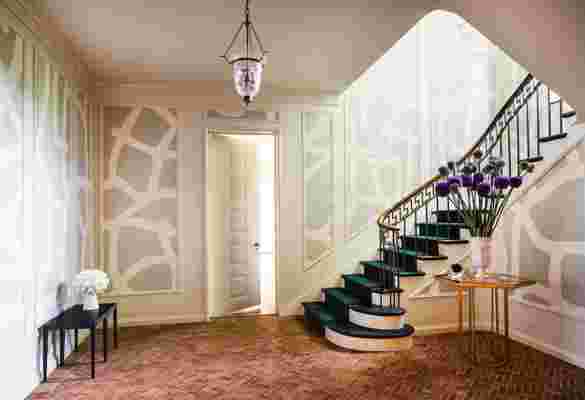
The foyer is the most dramatic transformation in the home. Previously, it had all been done in shades of brown. The designer brightened up the space by first painting the walls Benjamin Moore ’s Feather Down—a cool white hue—and then placed a gray-and-white-patterned wallpaper made of Japanese tea paper by Porter Teleo in the molding panels. The entryway table is from Interlude Home and the low table is a one-of-a-kind piece from Stephane Hubert Design .
For the Sands Point clients, a family with two young boys, the home needed to be kid-friendly, but they also wanted the overall design to feel more adult, and worthy of the elegant red-brick 1920s home. They were also keen to inject more color into the interiors, which, when they moved in, were quite drab and made many of the spacious rooms feel cavelike. During the renovation, McLeod and her team touched virtually every space of the home, which includes six bedrooms and six and a half bathrooms. But luckily, the bones of the house were excellent and no space needed to be gut-renovated. Moreover, architectural details like ceiling molding, millwork, and even original overhead lighting were also salvageable.
Many of these features proved to be ideal inspiration points for McLeod’s designs. In the home’s foyer, for example, the flooring is a unique and striking brick herringbone pattern. However, the room’s previous interior design was “brown on brown on brown,” says McLeod. “You couldn’t appreciate how beautiful the flooring was.” The designer brightened up the space by first painting the walls Benjamin Moore’s Feather Down—a cool white hue—and then placed a gray-and-white-patterned wallpaper made of Japanese tea paper by Porter Teleo in the molding panels. Finally, the swooping staircase received a peacock-blue runner, which added a trademark pop of color to the room. “This was the most dramatic transformation in the home,” McLeod says. “We brought modernity and life into the space.”
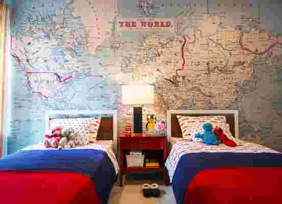
The color inspiration for one of the boy’s bedrooms is the floor-to-ceiling wall mural from Swag Paper . The beds are from Room & Board , the linens are Williams Sonoma Home , and the bedside table is a vintage piece with a custom lacquer.
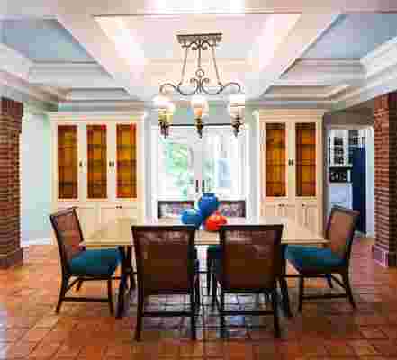
The juxtaposition of old and new is apparent in other rooms as well. McLeod’s favorite space is the family room, which still boasts its original coffered ceilings and built-in cabinets. But the previous owners had left the elegant millwork a dark cherry, which was both dated and too dark for the space. “It took some convincing to get the clients to let me paint it, but boy, that made all the difference,” McLeod says of coating them in Benjamin Moore’s Simply White. The designer also painted the interior of the ceiling coffers with a blend of Simply White and Palladian Blue, which not only makes the room seem taller, but draws attention to the elegant molding itself. Even more color was added with the addition of bright orange leather armchairs from Oly Studio, and coordinating throw pillows made with Robert Allen fabric. The final result is not only cheerful but elegant—a space fit for children and their parents.
But of course, there are no spaces more cheerful in the home than the children’s rooms. Wallpaper was an integral element in all of these, whether it’s the floor-to-ceiling map mural from Swag Paper in one of the bedrooms or the multicolored wallpaper from Style Library in the playroom. The latter was originally a fitness studio and “it was just horrible,” says McLeod. She brightened up the space with Benjamin Moore’s Tequila Lime on one wall, and then added other shades of green in the loveseat, area rug, and hanging paper lanterns. And, since this is a space for the littlest family members, McLeod had the inspired idea to use wood-printed LVT—luxury vinyl tile—instead of the real thing. “In person, it looks so convincing, but it’s practically indestructible, which is really great,” she says.
The Sands Point home, with its regal proportions and elegant bones, could very easily have been designed with a look-but-don’t-touch aesthetic. But in McLeod’s capable hands, it has been transformed into a livable and lively space—a true home instead of just a house.